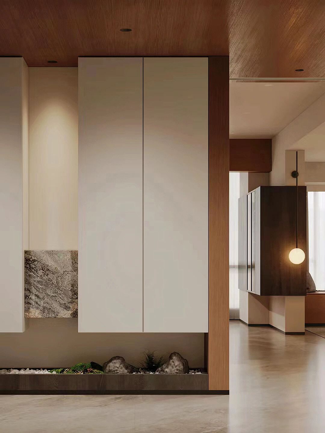
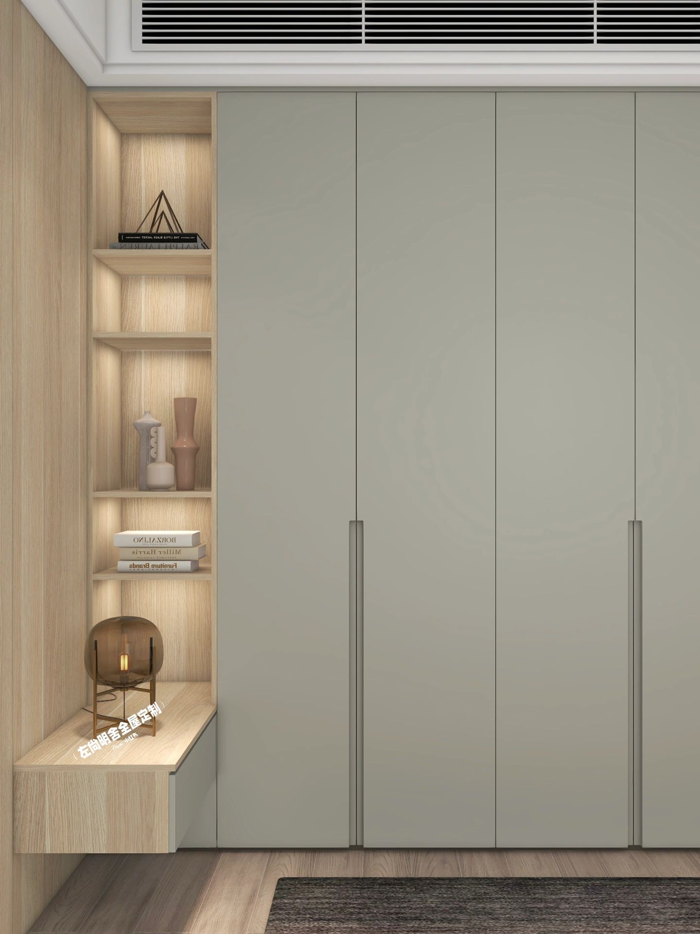
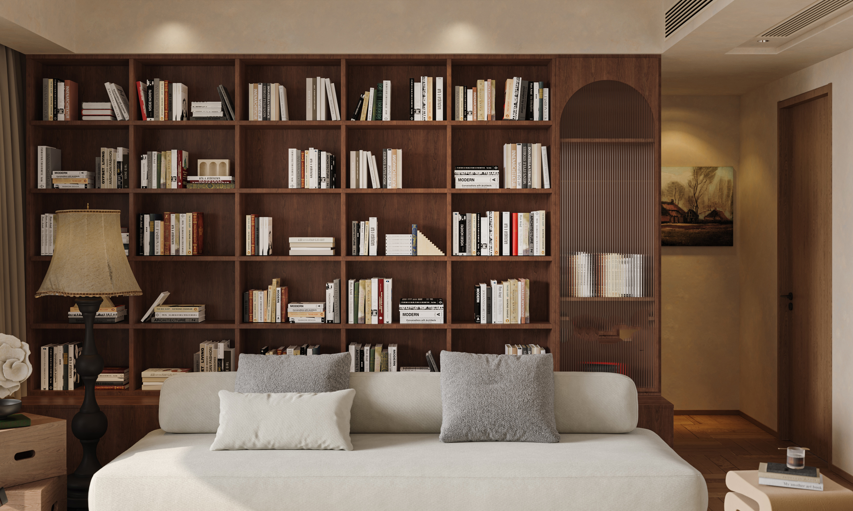
Whole-house customization color scheme—only when the proportions are right will the colors avoid looking off.
Common issues with whole-house color customization often stem not from the colors themselves being unattractive, but from an overabundance of hues, imbalanced proportions, and a disconnect between materials and color. This article presents a ready-to-use color‑coordination framework—featuring the 60-30-10 rule, four spatial strategies, and three practical evaluation methods—to help homeowners make well‑informed color choices they won’t regret.
First, let’s understand one thing: the color of the cabinetry sets the tone for the entire space.
In whole-house customization, cabinetry typically occupies more than 60% of the interior wall space. Once the cabinet color is chosen, the walls, flooring, curtains, and other furnishings should all be coordinated around it. Therefore, the proper sequence for color selection is to first establish the cabinet’s primary hue, then choose the wall colors and soft furnishings—rather than picking a wall paint first and then matching it to the cabinet doors.
In recent years, color trends have shifted from black, white, and gray to warm, natural tones. Light‑toned natural wood grains—such as white oak and pale maple—and earthy, neutral hues like beige, khaki, and warm gray have become the dominant palettes, while low‑saturation botanical greens are increasingly used as accent colors in select areas.
II. 60-30-10: A Proportion You Can Apply Straightaway
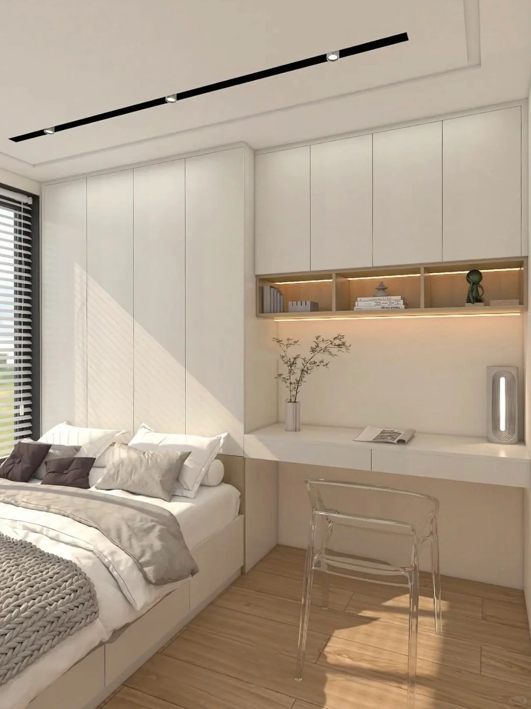
For whole-house customization, the most practical color‑scheme framework is the 60-30-10 rule: 60% primary color (used for large surface areas like cabinet bodies), 30% secondary color (applied to cabinet doors or open shelving), and 10% accent color (for handles, lighting strips, or select back panels).
When cream white is the dominant hue, allocate 60% of the cabinet surface to cream white, use light gray or oatmeal for 30% of the doors as a transitional tone, and accent with brass hardware or warm‑toned lighting strips in the remaining 10%. If light oak is the primary color, apply light oak to 60% of the cabinets and open shelves, pair it with white doors to soften the overall volume, and introduce dark or green accents in the remaining 10%. The key to this proportional approach is ensuring that no single color overwhelms the design.
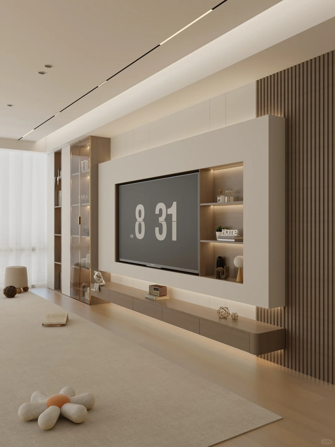
Color Scheme Strategies for Type III and Type IV Spaces
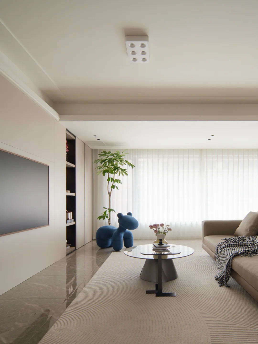
Living room: Neutral base with selective transitions. Group the TV cabinet, sideboard, and display cabinet together; opt for a color palette of white, light gray, and beige as the foundation, using wood tones or stone patterns for localized accents to avoid large swaths of bright colors. The living room’s color scheme should prioritize an open, airy feel and a welcoming atmosphere for guests.
Bedroom: Low-saturation tones for better sleep. Cream white, light gray, oatmeal, and muted blue-gray are safer choices, paired with matte, skin‑like cabinet doors. The wood tones should match those in the living room to avoid noticeable color differences between spaces. BOSNIE’s custom wardrobes offer a variety of matte finishes that perfectly complement the bedroom’s low‑saturation palette.
Kitchen: Light on top, darker below—prioritize stain resistance. Lighter upper cabinets (white, light gray) enhance a sense of openness, while medium-to-dark lower cabinets (gray, wood tones) are more resistant to dirt and help anchor the visual center. Choose a neutral countertop color that complements the cabinetry to avoid excessive contrast. BOSNIE’s thirteen custom cabinet series cover the full spectrum from light to warm neutral shades, allowing you to seamlessly coordinate upper and lower cabinets within a single design.
Children’s room: Neutral base with low-saturation accents. Use white or light wood tones as the base, and introduce low-saturation colors such as mint green, pale pink, and light blue on cabinet doors or open-shelf back panels to add subtle pops of color—avoiding large swaths of high-saturation hues that could disrupt emotional balance.
4. Material and Light: Two Hidden Variables in Color Coordination
The “weight” of a material’s color can change depending on its finish. Even the same shade will convey a completely different texture when paired with a matte, skin‑like finish versus a high‑gloss one. For creamy or natural wood styles, opt for matte, skin‑like surfaces or fine textured finishes; high‑gloss panels are better suited for small spaces that need to feel brighter and for modern design aesthetics. The BOSNIE panel collection offers a wide range of surface treatments, including matte, skin‑like, and fine grain—so when choosing a color, always refer to door panel samples or real‑life examples rather than relying solely on color swatches.
The “temperature” of light affects how colors appear. The same cabinet door will look different under natural and artificial light. In north-facing rooms, the light tends to be cooler, so warmer tones are preferable; in south-facing rooms, with ample natural light, both neutral and slightly cooler hues work well. For interior lighting, it’s recommended to use a uniform 3,000K warm white, consistent with the overall color temperature of the bedroom and living room.
V. Three Checks Before Landing
First, examine full-scale samples rather than color swatches. Color swatches are small, so their visual effect can differ significantly from that of large cabinet surfaces. Request that the retailer provide full‑size door panel samples, or observe the real‑world appearance of similar shades in completed projects.
Second, count the colors—limit yourself to no more than three primary hues. In any given space, whether it’s cabinetry, walls, flooring, or soft furnishings, keep the number of dominant colors to three or fewer; exceeding that threshold can easily blur the design’s focal point.
Third, check the space once with the lights off and once with the lights on. During the day, assess the overall harmony in natural light; at night, evaluate how the lighting affects the cabinet colors. If you’re satisfied in both settings, the color scheme is ready to be implemented.
The essence of whole‑house customization in color coordination isn’t memorizing trendy hues, but rather managing quantity, proportion, and material consistency. The 60‑30‑10 rule provides a proportional framework, four types of spaces offer directional guidance, and detailed samples and lighting tests ensure seamless execution. BOSNIE Private Residence Customization builds on a rich palette of finishes and colors, complemented by the designer’s holistic assessment of spatial light and materials, helping homeowners transform renderings into lived‑in, dream‑like homes.