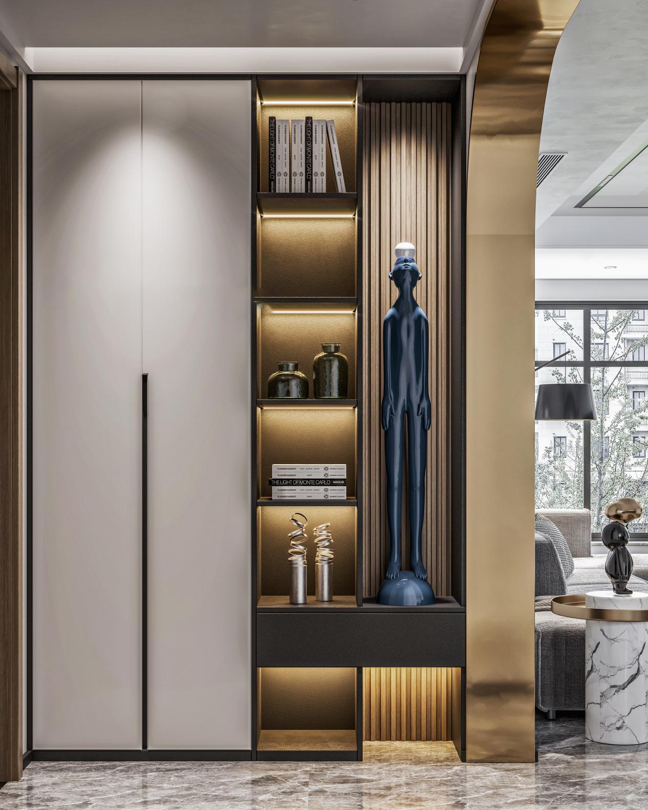
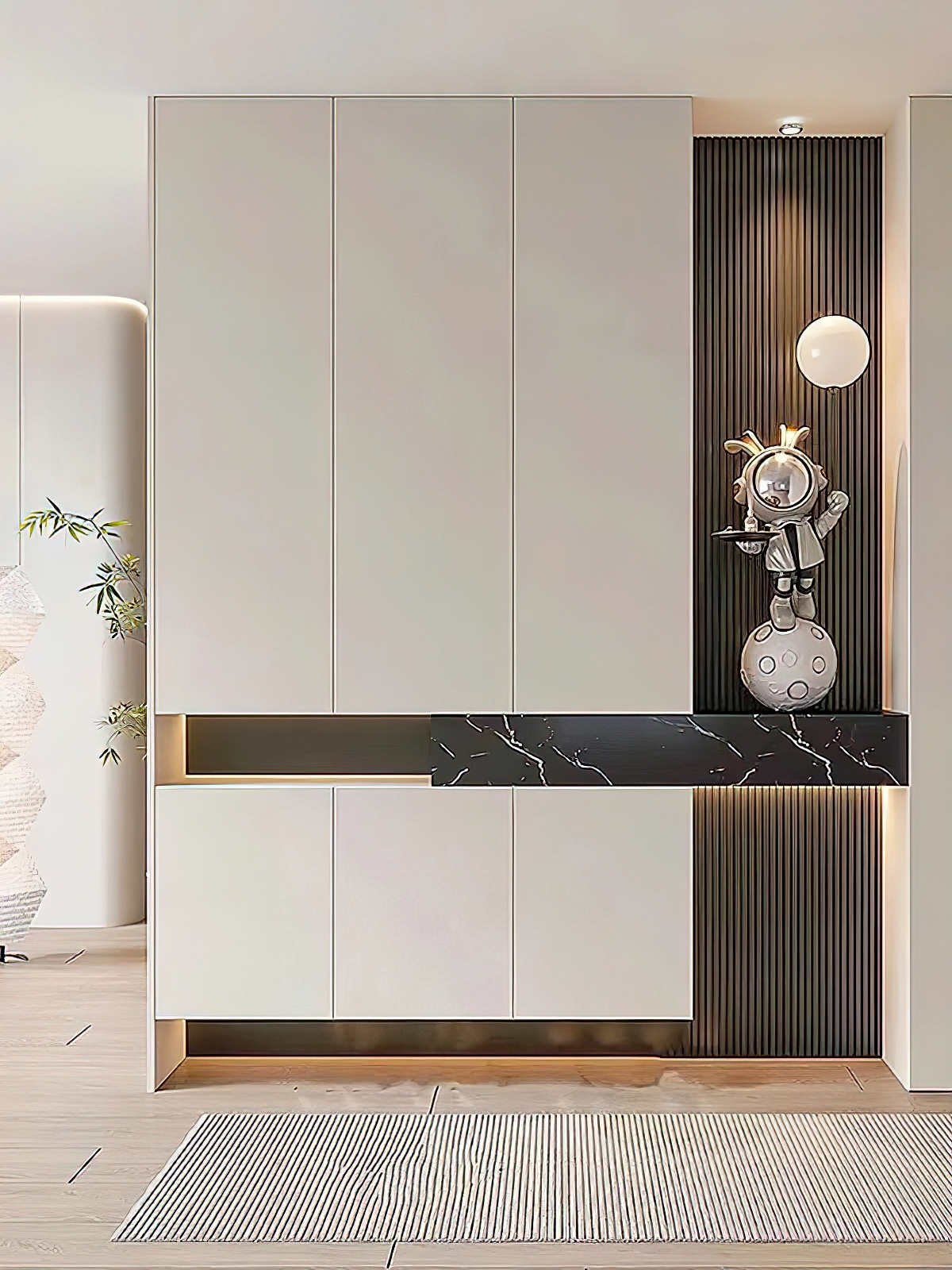
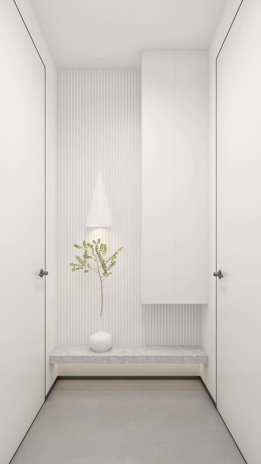
Whole-House Customization Color Scheme — Set the Tone in Three Steps, Creating a Home That’s Both Sophisticated and Timeless
Color scheme is the “first impression” of whole-house customization.
In whole-house customization, cabinetry accounts for more than 60% of the interior wall space, and the quality of the color scheme directly shapes the overall ambiance of the room. Many homeowners find after renovation that “even though they chose attractive panel materials, the finished result looks cluttered and cheap.” The root of the problem often lies in the color palette—too many colors, unbalanced proportions, or insufficient harmony between materials and hues.
BOSNIE Private Residence Customization treats color schemes as a design element of equal importance to spatial functionality, helping clients strike a balance between their color preferences and the overall character of the space.
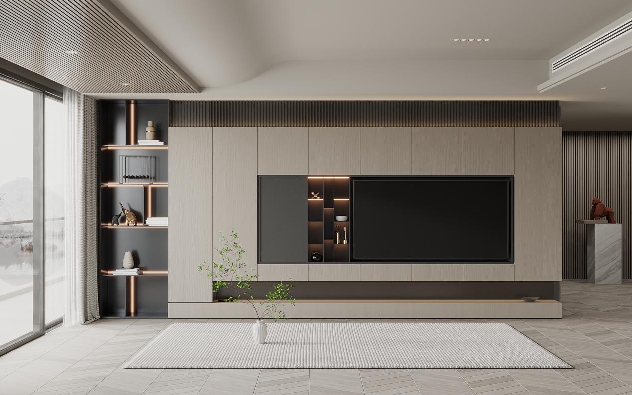
Step 1: Determine the primary color—subtract rather than add.
When it comes to whole-house customization, avoid overusing colors; stick to the golden rule of “one dominant color + two accent colors + one highlight color” to prevent a cluttered, “palette‑like” color scheme.
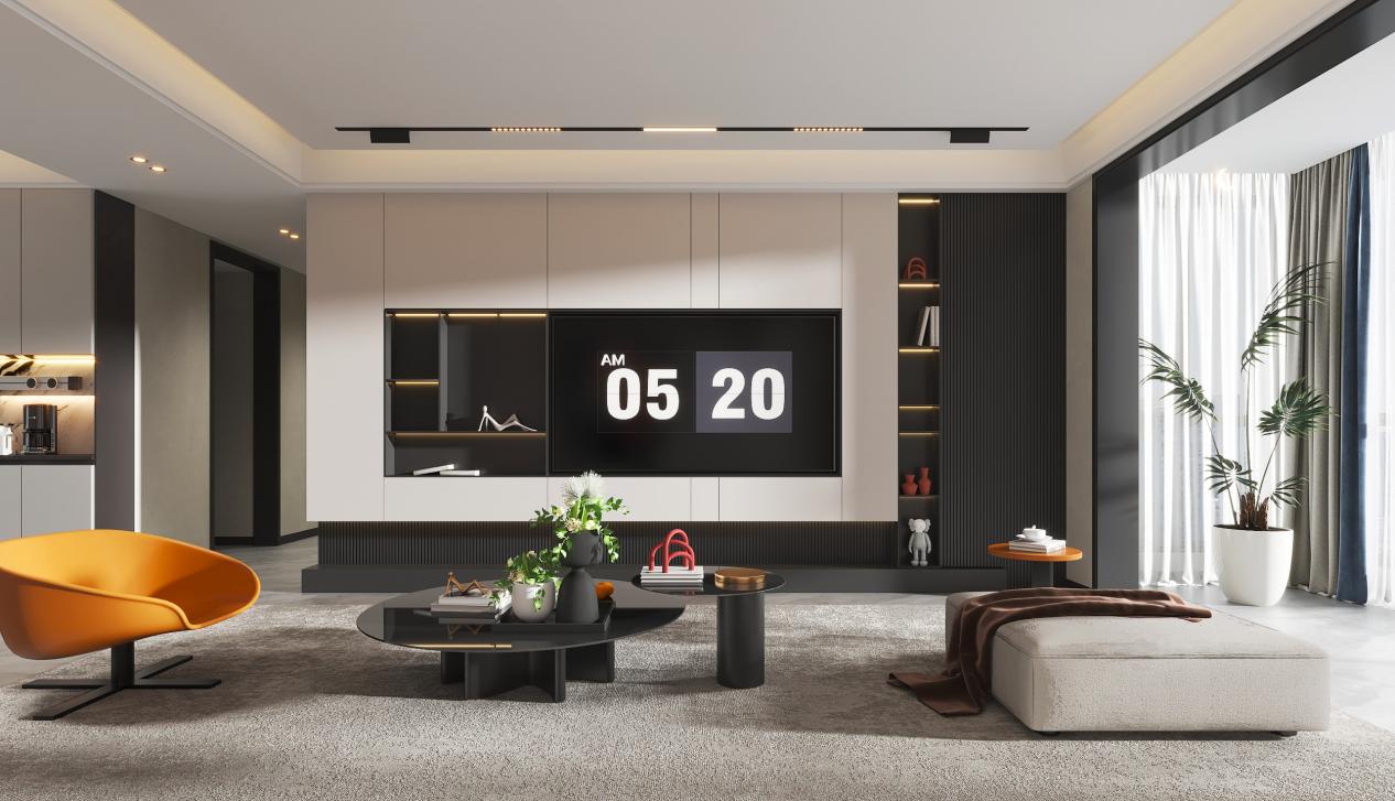
A monochromatic gradient is the most reliable color‑matching strategy. Choose one dominant hue—such as off‑white, light gray, or natural wood—and pair it with varying shades from the same family: for example, off‑white for the cabinet body and light gray for the open shelves, or natural wood for the cabinet frame and a lighter wood tone for the doors. Keep the color difference within two levels; this creates visible depth without jarring contrasts.
Black, white, and gray, paired with one accent color, create visual depth. Use white or gray for the main cabinet body (accounting for 80%), and introduce a low-saturation accent color—such as Morandi pink or haze blue—on select areas like open‑shelf back panels or drawer fronts (making up 20%). Limit the accent color to just one or two spaces to prevent visual clutter that can result from its overuse throughout the entire home.
Wood tones paired with white is a timeless, classic combination. You can opt for wood‑toned cabinets with white doors—this 7:3 ratio creates a warm feel—or white cabinets with wood‑toned open shelves, which offers a crisp, clean look. It’s important to keep the wood tones consistent: avoid using different wood species in the living room and bedroom, as this can create a disjointed effect.
Step 2: Control Color Proportions—The 60-30-10 Rule
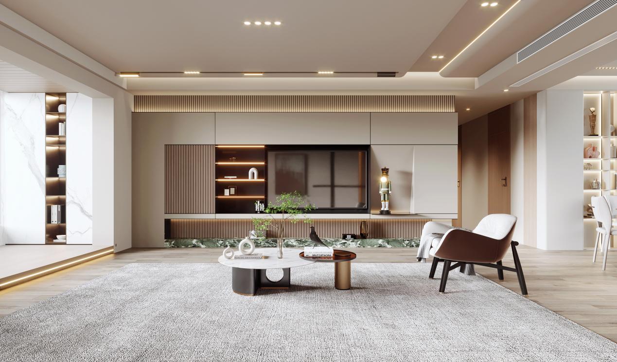
In a color scheme, the proportional distribution of colors is just as important as the colors themselves. The 60-30-10 rule provides a clear framework: 60% for the dominant hue (the large surface area of cabinets), 30% for the secondary hue (cabinet doors or open shelving), and 10% for accent colors (handles, lighting strips, and decorative elements).
In practical application, this means that if cream white is chosen as the primary color, most of the cabinet surfaces should be in cream white; a secondary shade—such as light gray or oatmeal—can be used for cabinet doors or select wall panels; and accent colors like brass‑toned handles or warm‑tone LED strips can infuse the space with a sense of warmth.
Step 3: Matching the Space’s Ambiance — Color-Coordination Strategies for Different Rooms
Living Room: The living room is the space where whole-house custom cabinetry is most concentrated—think TV cabinets, display cases, and sideboards. For color schemes, stick to neutral tones: white, light gray, and beige as the base, with accents of wood or stone textures to create smooth transitions. Avoid overly bright hues; the palette should enhance the sense of openness and foster a welcoming atmosphere.
Bedroom: The bedroom’s color scheme should prioritize restful sleep. Low-saturation Morandi tones—such as Morandi gray, Morandi blue, and milk-tea shades—paired with natural wood‑tone cabinets, create a calm, stable atmosphere perfect for unwinding. BOSNIE custom wardrobes offer a wide range of finish options, from matte skin‑like textures to delicate woodgrain patterns, helping homeowners achieve seamless harmony between touch and sight throughout the bedroom space.
Kitchen: The kitchen’s color scheme should balance aesthetics with practicality—prioritizing stain resistance. For upper cabinets, opt for light shades like white or pale gray to enhance the sense of openness; lower cabinets can feature medium-to-dark tones such as gray or wood finishes, which are both durable and help anchor the visual center. Choose a neutral countertop color that harmonizes with the cabinetry to avoid stark contrasts. BOSNIE’s custom cabinetry offers a wide range of color‑palette options, with thirteen distinct product lines spanning the full spectrum from light to dark.
Children’s Room: The color scheme for a child’s room can be moderately playful, but saturation should still be kept in check. It’s recommended to use white or light wood tones as the base, with 1–2 low-saturation colors—such as mint green, pale pink, or light blue—as accents, incorporated through cabinet door colors or open-shelf back panels. Avoid using high-saturation colors over large areas to prevent disrupting the child’s emotional stability.
Practical recommendations for implementing color schemes
View the full-size sample before deciding on the color: Color swatches can look significantly different from the actual finish on large surfaces. We recommend asking the retailer for a full-door sample or visiting completed projects in person.
Consider the impact of lighting: Cabinet colors will appear differently under natural and artificial light. For north-facing rooms, opt for warmer tones; in south-facing rooms, you can choose cooler, neutral shades.
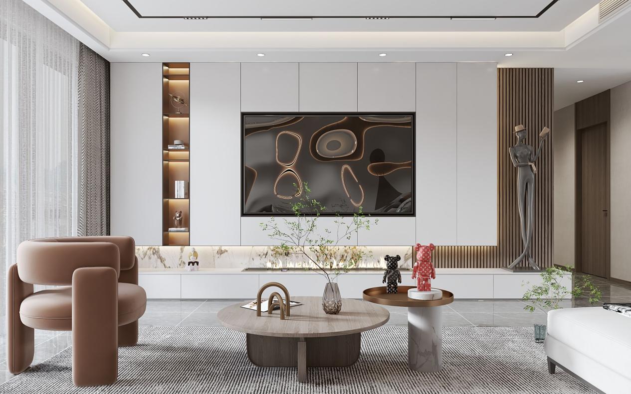
Lighting serves as an extension of the color scheme: cabinet interior and under‑cabinet lighting not only enhances functional illumination but also accentuates the depth and layering of the cabinetry’s colors. It is recommended to use a consistent 3000K warm white color temperature for all light strips.
BOSNIE Private Residence Customization offers an extensive palette of colors and a wide array of materials, including nano‑crystal, acrylic, baked enamel, PET, solid wood, and more—spanning thirteen major product lines—to meet the color‑coordination needs of whole‑house customization across diverse styles and spaces. By choosing BOSNIE, a leading brand in whole‑house customization, you can rest assured that every step—from conceptualizing the color scheme to final execution—is meticulously guided by professional designers, ensuring that the design vision aligns seamlessly with the finished space.