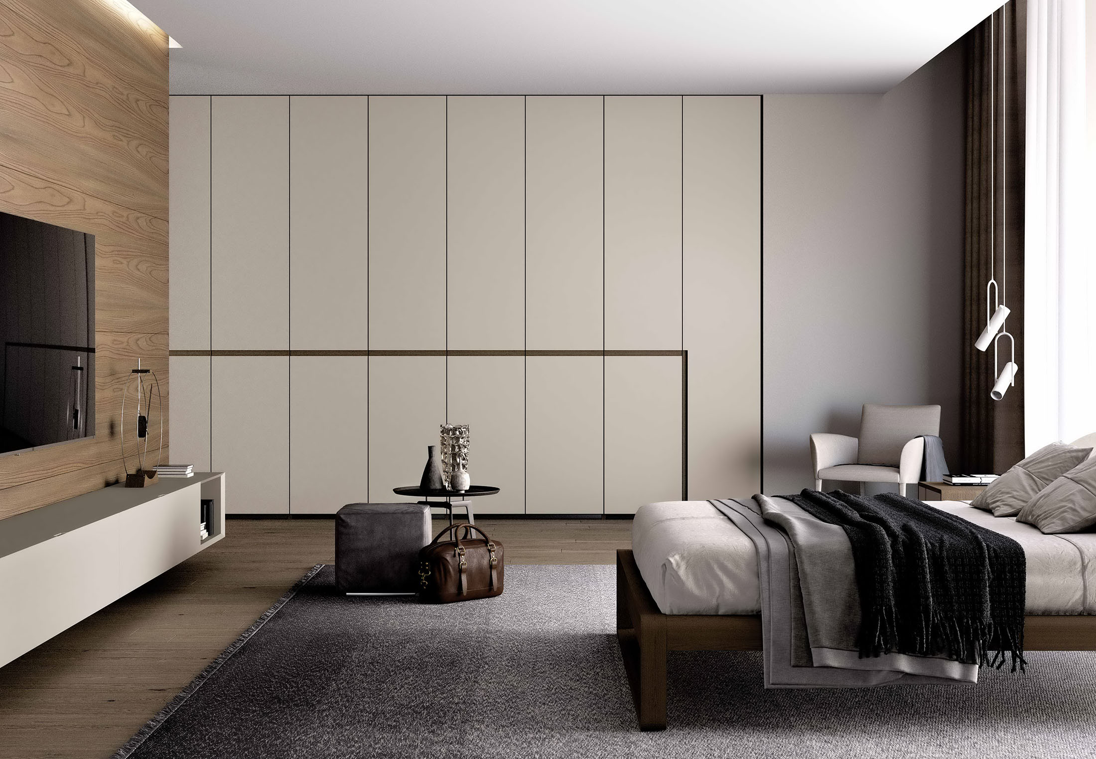
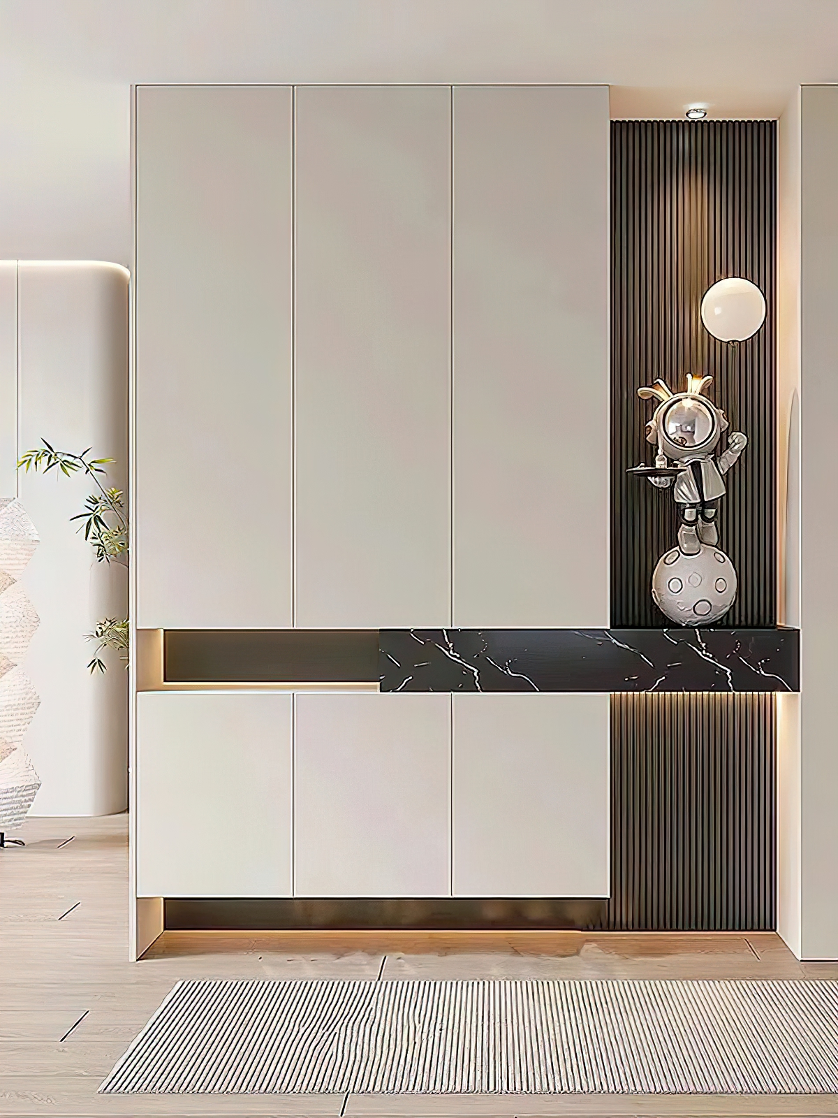
Three sophisticated walnut tones to transform your home into a soothing, healing haven.
The Healing Power of Wood
It’s never a stunning first impression.
Rather, it is through day after day of living together,
The warm, tactile essence of home.
Just like walnut wood,
Not competing, not vying,
Yet it lends Italian minimalism an added touch of composure,
Add a touch of warmth to modern minimalism,
Add a touch of elegance to the new Chinese style.
PART 01 Choosing the Right Wood Tone
Walnut wood, with its naturally occurring grain—sometimes fine and dense, other times bold and free—exhibits a range of hues and patterns, lending each space a distinct sense of texture.
Therefore, not every walnut hue deserves the label “luxurious.” The essence of walnut’s premium appeal lies not only in the depth of its color but also in the natural beauty of its grain and the nuanced layering of its tones.
When selecting walnut wood, avoid grain patterns that are overly uniform and resemble plastic veneer; in terms of tone, steer clear of yellowish or reddish hues.
High‑grade walnut wood should feature a fine, smooth grain with subtle variations in tone and depth, even incorporating a few natural knots—this very “imperfection” lends the wood an authentically tactile quality.
01 Classic Walnut
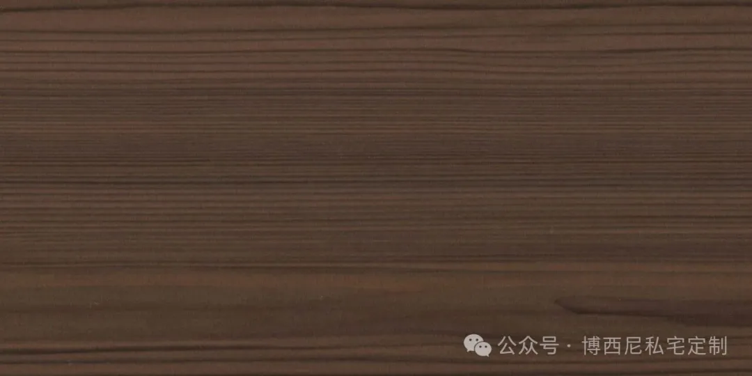 Classic walnut boasts a soft, well‑balanced medium‑warm brown hue, with fine, soothingly flowing grain and no exaggerated knots or jarring color patches. Its touch is warm and smooth, as if cloaked in a gentle, low‑saturation filter.
02 Windsor Walnut
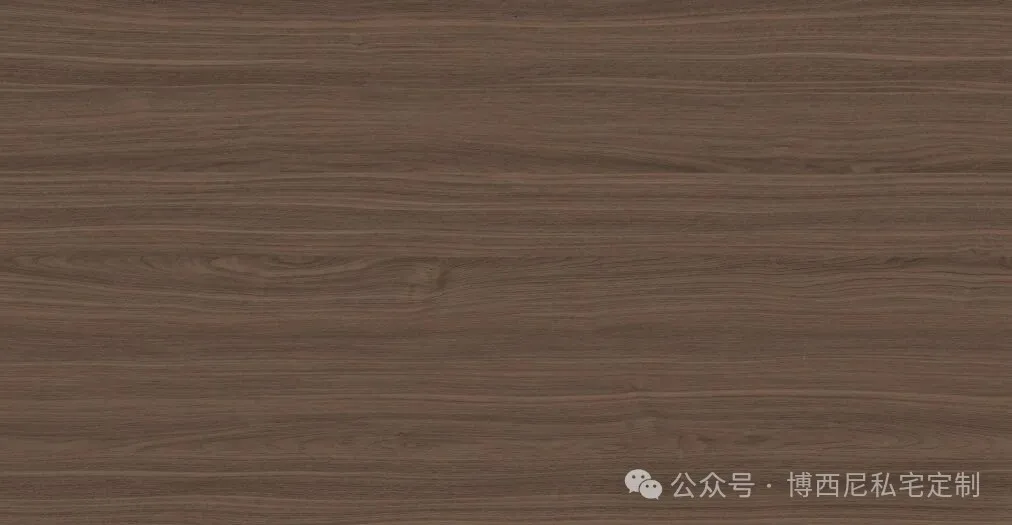 Windsor Walnut boasts a light, warm brown hue that sheds the heaviness of dark walnut. Its fine, soft grain patterns are complemented by the natural wood’s casual, undulating texture, creating an overall clean and airy aesthetic with an inherent sense of effortless elegance.
03 Ancient Charm Walnut-2
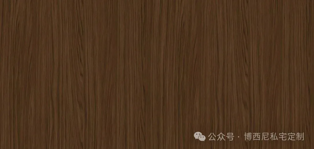 Ancient‑style Walnut‑2 in a deep tobacco brown—rich, full‑bodied in color, with wood grain that alternates between light and dark, exuding a powerful textural tension. As light and shadow play across the surface, subtle gradations of brightness and shade evoke the profound depth and time‑worn character of enduring elegance, making it ideal for spaces that demand a poised, commanding presence.
PART 02 Choosing the Right Color Scheme
Walnut is the finest backdrop for home interiors.
It hardly ever picks its partner and gets along particularly well with certain colors.
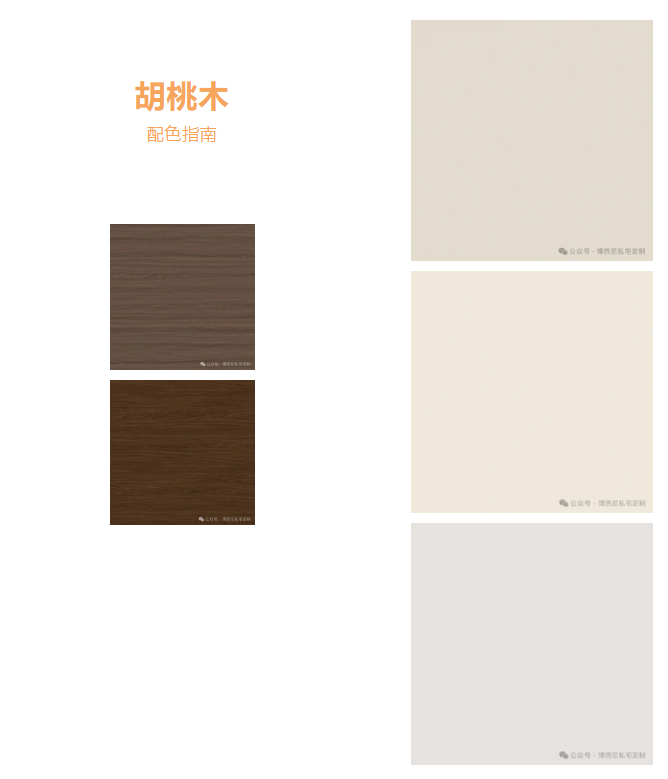
White and cream white, paired with walnut wood, form the most classic combination. White brightens the space, while walnut wood sets the tone, creating a clean yet warm ambiance—perfect for modern minimalist and Japanese‑style interiors.
Gray and light gray, cool and restrained, exude an urban vibe; paired with medium-brown walnut wood, the sense of sophistication is instantly elevated.
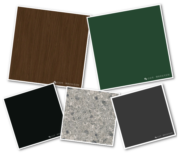
Black paired with dark gray and walnut is the quintessential hallmark of Italian minimalism. Travertine combined with walnut creates a naturally relaxed ambiance, as if time itself has slowed its pace here.
Moss green and olive green, paired with walnut brown, form the quintessential vintage‑midcentury combo; their bold juxtaposition subtly cultivates a chic, nostalgic vibe.
PART 03 Mastering the Details
Once you’ve chosen the pattern and color scheme, the finishing touches at floor level often make all the difference.
When choosing a floor plan, consider light versus dark tones. For smaller units, opt for the lighter shades of Windsor Walnut to prevent darker hues from absorbing light and creating a claustrophobic feel; for larger open‑plan layouts or south‑facing units, don’t hesitate to embrace the rich, timelessly elegant Old‑World Walnut—its deeper tones will enhance the space’s presence and grandeur.
BOSNIE Private Residence Customization rejects the “all-wood throughout” approach. Instead, cabinets, walls, and door panels are styled in white and beige paired with walnut, with proportions carefully balanced at 60% to 40%, allowing the space to feel open and airy.
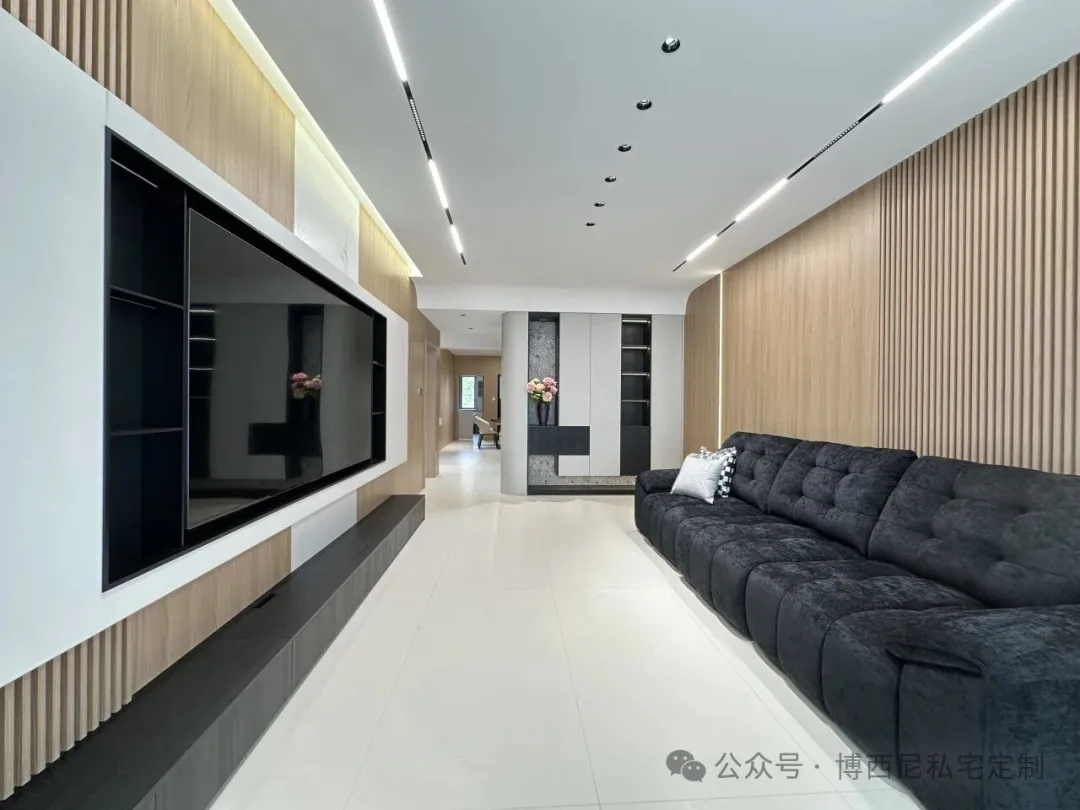
Pay attention to the wood grain direction. Vertical grain elongates the height and is ideal for cabinet doors and wainscoting; horizontal grain widens the space and works well for low cabinets and tabletops.
Hardware is the final touch of refinement. A shiny plastic handle can ruin an entire cabinet. Matte metal or handle‑free designs keep the look clean and seamless, preserving that sense of luxury.
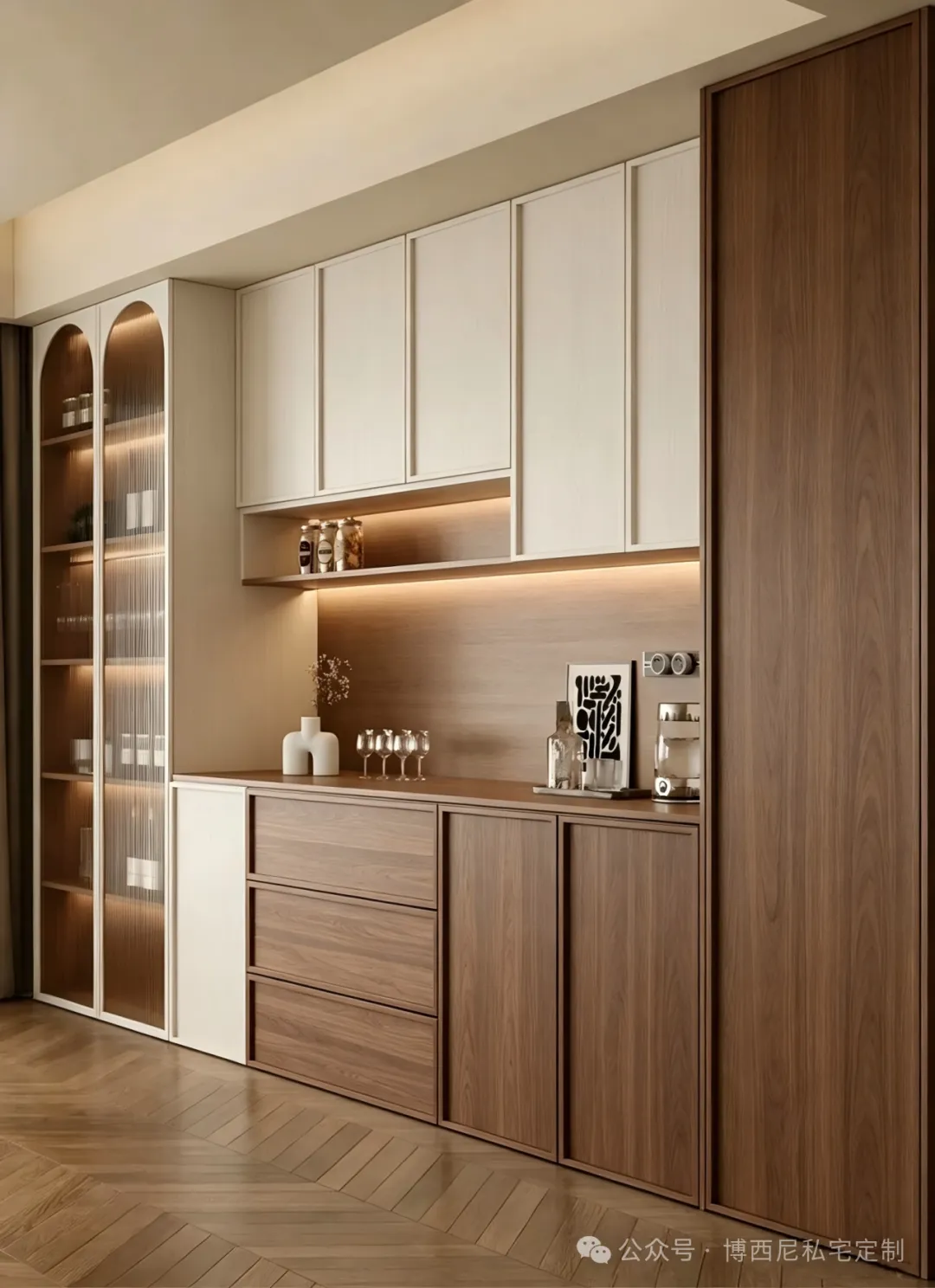
Walnut wood has long been a timeless choice for furnishings, from classic low tables to contemporary interiors. It bears the everyday rhythms of life, gently weathered by the passage of time, lending homes an effortless sense of warmth and sophistication.
The sophisticated elegance of walnut lies not in ostentation, but in its natural, effortless expression—achieved through thoughtful design. BOSNIE Private Residence Customization helps you choose the perfect grain and color palette, master the art of pairing hues, and refine every detail, bringing your dream home to life.