How to coordinate colors in whole-house customization? The 60-30-10 rule and four types of spatial strategies.
The most common reason for color‑scheme mishaps in whole‑house customization isn’t that the colors themselves look bad—it’s having too many hues, an unbalanced proportion, or a disconnect between materials and color. Master one fundamental rule—the 60-30-10 ratio—and then tailor your approach to the space’s specific conditions; this way, you can make color‑selection decisions you won’t regret.
1. The 60-30-10 Rule: Let Each Color Find Its Place
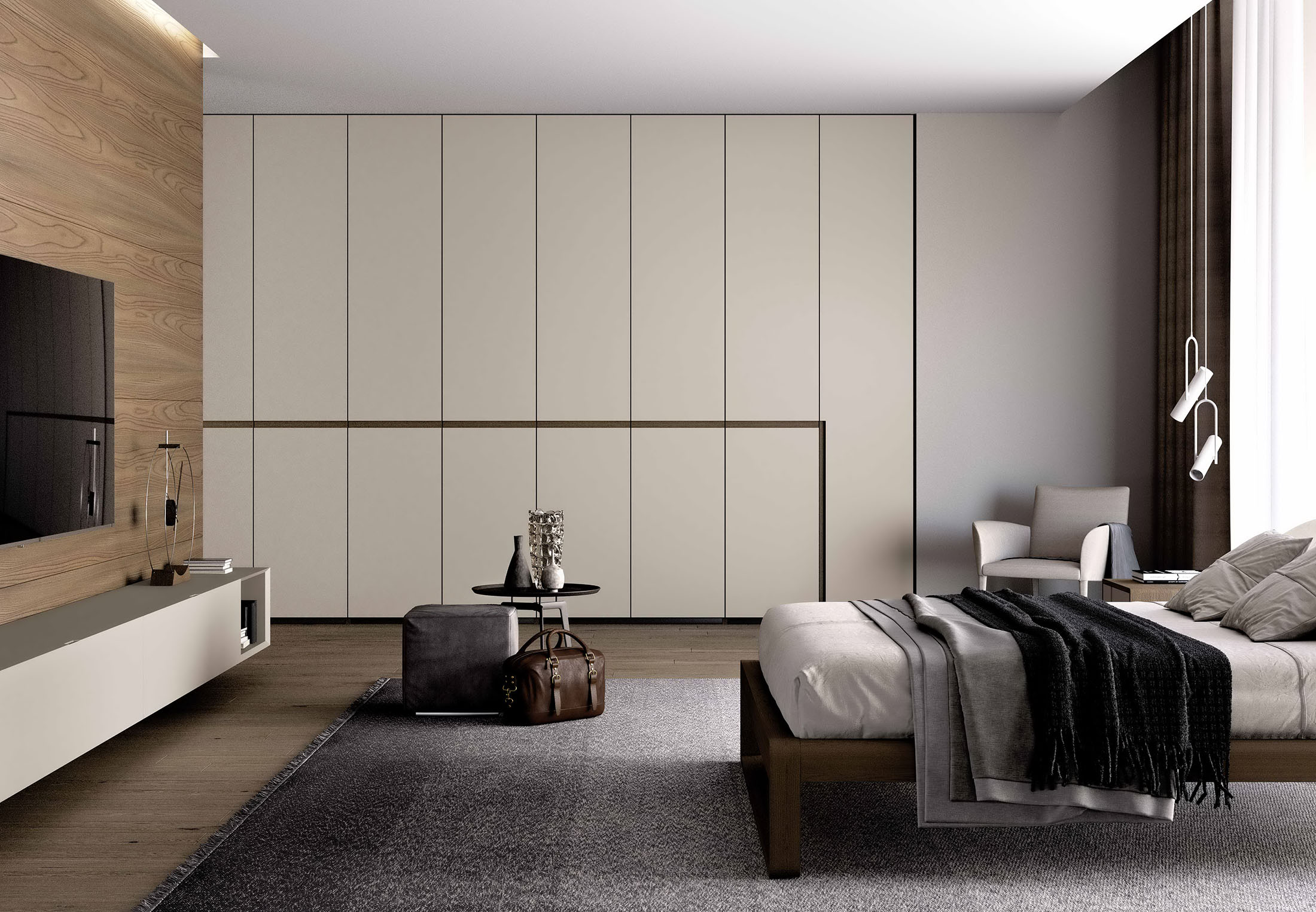
Divide the space’s color scheme into three layers: 60% background color—used for walls, ceilings, and large‑area cabinetry as the quiet foundation of the space; 30% main accent color—applied to medium‑sized elements like cabinet doors, wainscoting, and curtains to define the space’s character; and 10% accent color—reserved for details such as pulls, lighting, and decorative accessories to add brightness and a sense of airiness. If you wish to introduce additional colors beyond these three layers, stay within the 10% accent‑color budget rather than creating a new layer.
II. Color Scheme Strategies for Four Types of Spaces
Small apartments: Use light colors as the base and opt for an open-plan layout to create a more spacious feel.
A low-saturation color palette dominated by cream white, oatmeal, and light natural wood tones, paired with monochromatic treatment for doors, walls, and cabinets, minimizes visual fragmentation and visually expands the space. Accent colors in warm wood or metallic shades work best in small doses.
Mansion: Alternating shades of depth to create a sense of layering.
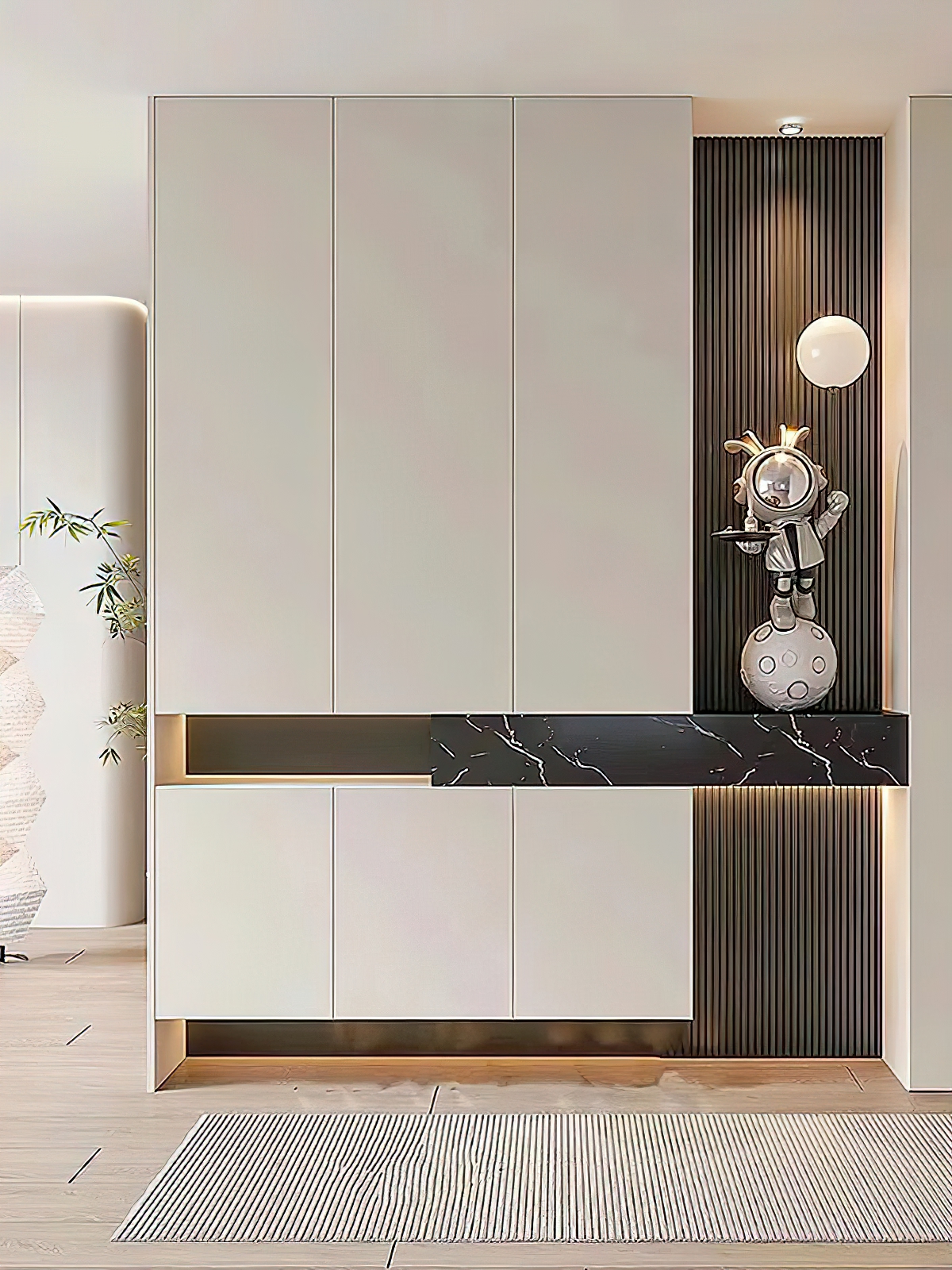
Large spaces can effortlessly accommodate the weighty presence of dark tones. Use deep walnut or smoky blue as the base layer, pair it with light‑colored cabinet doors for a smooth transition, and accent with metallic or stone textures to create a rich, layered color scheme with depth.
Insufficient natural light: Avoid large areas of cool gray.
In north-facing spaces or areas with limited natural light, cool gray tones can amplify a sense of heaviness and gloom. We recommend opting for warm‑toned, light shades such as warm white, cream, or wood tones, and enhancing the ambiance with lighting in the 3000–3500K color temperature range—warm white light.
Abundant natural light: You can experiment with deep wood tones and Morandi hues.
Spaces with ample natural light can effortlessly accommodate rich wood tones and Morandi-inspired low-saturation hues—such as gray-green, misty blue, and bean‑paste pink—where the sophisticated allure of color is most effectively brought to life.
III. Three on-site inspections—complete them before signing the contract.
First, compare color swatches side by side. Arrange the actual color samples for cabinet doors, wall panels, and flooring together; avoid relying solely on individual swatch cards. Second, verify with full‑size samples. Request that the supplier provide at least A4‑sized samples of the actual materials, as the visual impression of a small swatch can differ significantly from that of an entire cabinet door. Third, check under appropriate lighting. Reassess the color on site, using the same lighting conditions (or a light source with the same color temperature), since the same panel may appear markedly different under natural light versus warm lighting.
IV. Beyond Color: Texture Is the Invisible Color
Even within the same color, matte baked enamel, wood veneer, and acrylic evoke entirely different visual experiences. The next step in custom color coordination is to let materials themselves inform the palette: the warm, tactile quality of wood grain, the composed coolness of stone, and the refined sheen of metal—using material contrasts to replace layered hues, so that the space feels both rich and restrained. This is also the design philosophy behind collections like the “low-saturation, softly sophisticated, light‑and‑healing” Morandi‑inspired series.
About BOSNIE
BOSNIE Private Residence Customization offers a comprehensive color‑scheme solution that harmonizes cabinets, doors, walls, storage, and hues, with seven signature collections—including Natural Wood, Heart‑Fluttering Morandi, and Oriental Elegance—catering to diverse spatial moods. With over 500 stores nationwide, it provides free color‑consultation and design services, positioning itself as “high‑quality, aesthetically appealing, and highly cost‑effective” to bring a touch of sophistication into everyday life.
Frequently Asked Questions (FAQ)
Q: How can you choose the perfect cabinet door color for whole-house customization without making a mistake? A: Follow the 60-30-10 rule: let the cabinet doors serve as the 30% accent color, creating visual depth against the background, and keep the total number of primary colors in the home to no more than three.
Q: What cabinet colors are best for small apartments? A: Light color schemes—such as creamy white, oatmeal, or light natural wood—paired with handleless, minimalist styling and cabinets that blend seamlessly into the wall can create a more spacious visual effect.
Q: Do the cabinet body and doors have to be the same color? A: Not necessarily. The cabinet body looks more appealing when it’s the same color or a shade darker, while the doors can take on the role of the main accent color. The key is to confirm the overall effect by comparing physical color samples side by side under different lighting conditions.