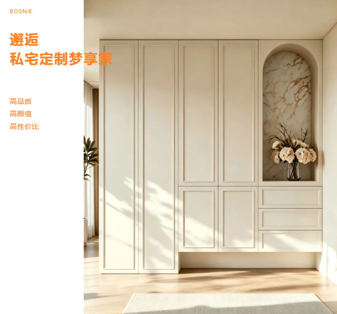
Mid-century modern whole-house customization color scheme: Bring the warmth of time into your home.
Mid-Century Modern captivates not because it “looks like an old movie,” but because it reinterprets the design wisdom of the mid-20th century in a more contemporary way. In whole-house customization, color palettes are the key to unlocking or undermining the Mid-Century Modern aesthetic—too muted and it feels bland; too bold and it risks becoming overly kitschy. The color scheme below will help you nail the perfect temperature for this timeless style.
1. Main Color Scheme: Earth tones as the base, saying no to cold white.
The core tone of the Chinese‑style aesthetic is warmth. For the main color scheme of whole‑house custom cabinets, we recommend choosing from the following earthy hues:
Milk coffee/ oatmeal: softer than pure white and more nuanced than beige, ideal for large‑area cabinet doors—gentle and non‑glaring.
Warm Gray: A gray with a hint of yellow or brown, it exudes a more vintage‑inspired vibe than cool gray and works well in spaces with a strong modern aesthetic.
Light Walnut: Used as an accent color for cabinet bodies or open shelving, it sets a wood‑toned foundation.
Pro tip: When going for a mid-century modern style, steer clear of cold white or bright white for cabinet doors—those “hospital‑like” tones can instantly ruin the vintage vibe.
II. Wood Selection: The Soul of Mid-Century Style
Medieval‑style interiors are inseparable from the tactile warmth of solid wood. In whole‑house customization, the choice of wood is even more crucial than its color:
Walnut: A deep brown with purplish undertones, featuring an elegant grain; ideal for cabinet frames, dining tables, and coffee tables, making it the quintessential wood of mid‑century style.
Teak: Golden with a brownish hue, it boasts a warm, lustrous finish, making it ideal for cabinet doors or display cabinets, and exudes an inherent South Seas vintage charm.
Cherry wood: reddish-brown tones that deepen with age through oxidation, making it ideal for small accent details such as drawer fronts and shelves.
Pairing suggestion: In a single space, limit wood tones to no more than two. Use walnut as the primary material, and accent it with teak or cherry for distinct layers that remain cohesive rather than cluttered.
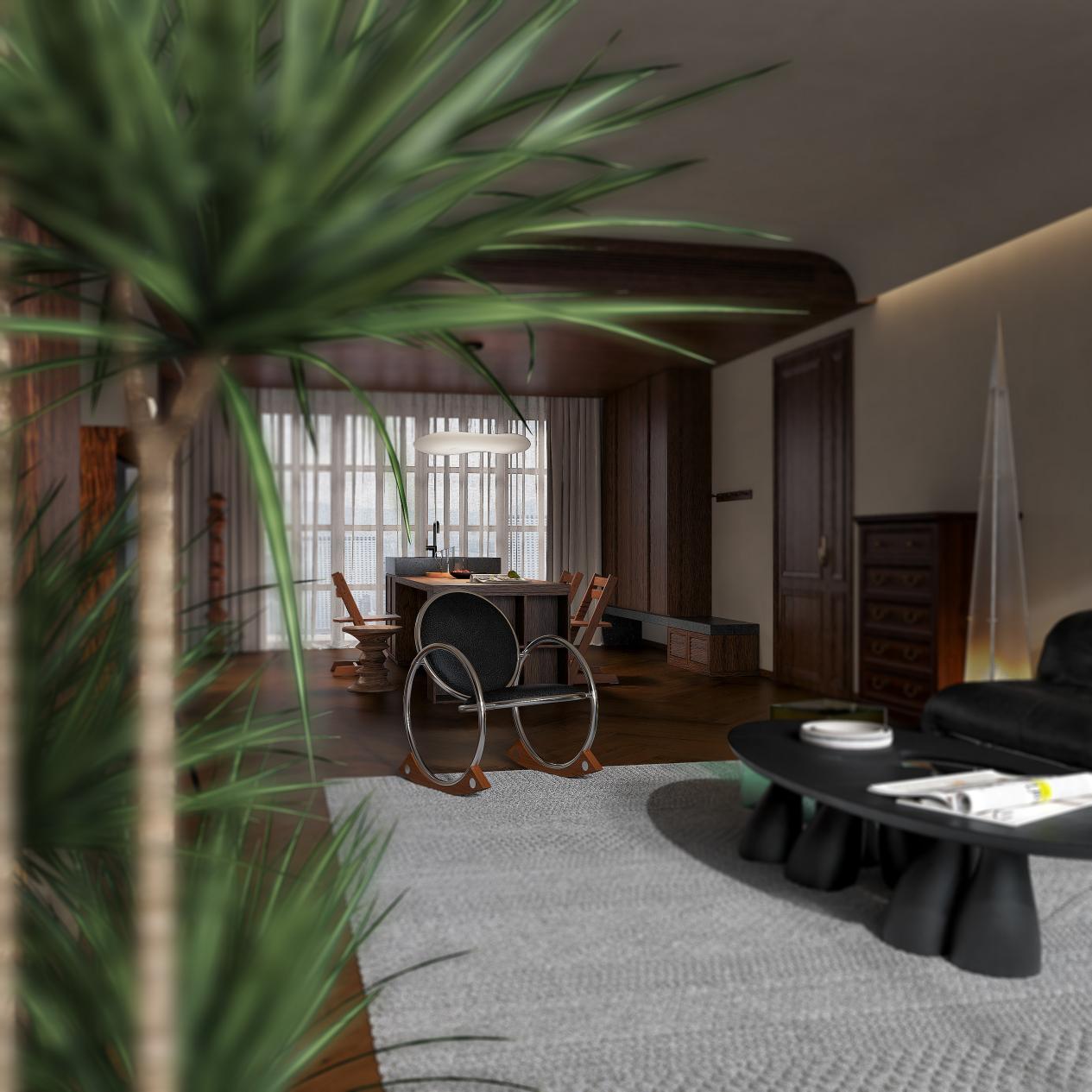
3. Accent Colors: Add a splash of color in small doses—subtle highlights that enhance the design without stealing the show.
When it comes to accent colors in a vintage‑inspired aesthetic, the key is “restrained sophistication.” Here are a few recommended shades:
Retro Green (Olive Green/Sage Green): Use it on the back panels of sideboards, in open shelves of bookcases, or as an accent in bedroom wardrobes to instantly evoke the 1950s.
Caramel/Pumpkin: A soft‑decor color scheme or a pop of color on select cabinet panels—warm and soothing, and the perfect match for walnut wood.
Mustard Yellow: Use in very small doses—such as drawer pulls or shelf edges—to brighten the space without overwhelming it.
Black: Used for metal handles, cabinet trim, and lighting fixtures to enhance the industrial aesthetic and refined elegance of a vintage‑inspired look.
Golden Ratio: 70% earthy tones as the main palette + 20% wood grain texture + 10% accent colors
IV. Practical Color-Scheme Solutions for Spatial Design
Living room: The cabinetry features oat‑white flat-panel doors, with select open shelves in walnut and a retro‑green painted back panel. Paired with slim‑framed black glass doors, it’s the perfect setting for a few well‑loved books and ceramic accents, instantly evoking a mid‑century modern vibe.
Bedroom: The wardrobe is finished in warm gray, with cherry‑wood‑toned interior shelves. The headboard wall is painted in a soft café beige or caramel hue, creating a subtle interplay of light and dark that lends the sleeping area a gentle, serene atmosphere.
Kitchen: The base cabinets are in walnut, the wall cabinets are milky white, and the countertops are either off-white quartz or terrazzo. We’ve opted against high-gloss finishes; matte or soft‑to‑the‑touch surfaces lend a more refined, tactile quality.
Study/Foyer: A floor-to-ceiling bookcase features a walnut frame and black metal shelves, complemented by a brass table lamp, exuding a distinct vintage, intellectual vibe.
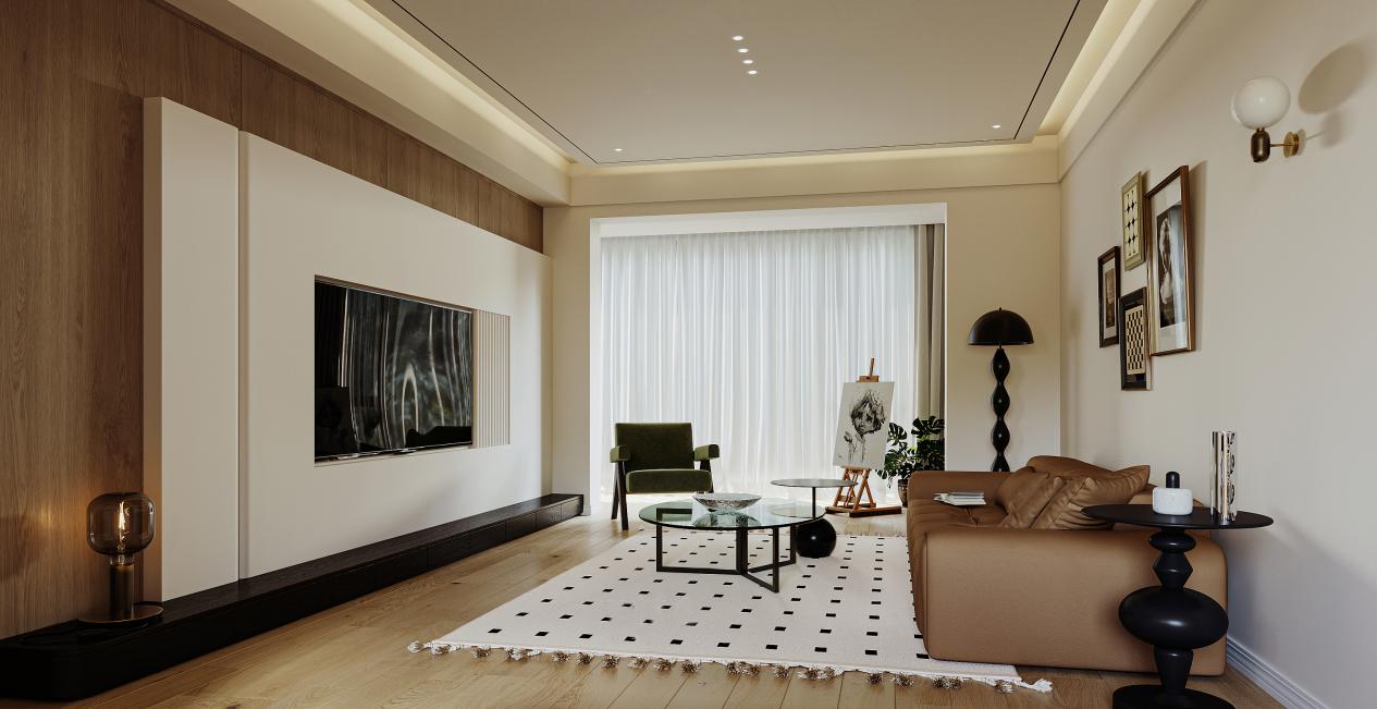
V. Key Details in Material Pairing
The medieval style is not merely a play of colors; it is, above all, a dialogue of materials:
Cabinet doors: Opt for matte, soft-touch, or wood-grain veneer finishes—say no to high-gloss lacquer.
Hardware: Brass and black brushed metal handles, with a clean, geometric design.
Countertops: terrazzo, travertine, or stone slabs (matte finish optional), offering a more vintage‑inspired aesthetic than quartz.
The color palette of the mid‑century style essentially strikes a balance between restraint and warmth. It doesn’t require you to pile on retro elements; instead, earthy tones, natural wood textures, and just the right accents are allowed to converse organically within the space.
When designing a whole-house custom space in a vintage style, remember this rule: choose the wood first, then select the main color, and finally add accents.
As you step through the door, a cream‑coffee‑colored cabinetry, the warm scent of walnut, and a soft, golden glow greet you all at once—this is the timeless warmth that mid‑century modern style brings.