Creamy Mid-Century Style | Gentle without being cloying, vintage without feeling oppressive
Living Knowledge · 2026.06.23

Creamy Mid-Century Style | Gentle without being cloying, vintage without feeling oppressive

Creamy Mid-Century Modern | Gentle but not cloying, vintage yet not oppressive. If you love the soft, soothing charm of cream‑toned interiors but worry that an all‑white palette can feel too plain or grow tiresome, and if you’re drawn to the timeless, textured appeal of mid‑century modern design but fear dark wood tones might weigh things down and make your home feel dim and stifling, then this cream‑and‑mid‑century‑modern whole‑house customization is just what you’ve been looking for. It strikes the perfect balance, blending the best of both styles to create a home décor that’s both enduring and endlessly appealing—perfect for long‑term living. A purely cream‑based aesthetic tends to feel light and lacks visual anchor, which can make it feel monotonous over time; meanwhile…

Creamy Mid-Century Style | Gentle but not cloying, vintage yet not oppressive

If you love the soft, soothing charm of cream‑style interiors but worry that an all‑white palette can feel too plain or grow tiresome, and if you’re drawn to the vintage allure of mid‑century modern design yet fear that dark wood tones might make your home feel heavy and gloomy, then today’s whole‑house customization in a creamy mid‑century blend is just what you’ve been looking for. It strikes the perfect balance, seamlessly marrying the strengths of both styles to create a timeless, enduring home aesthetic that stands the test of time.

image1

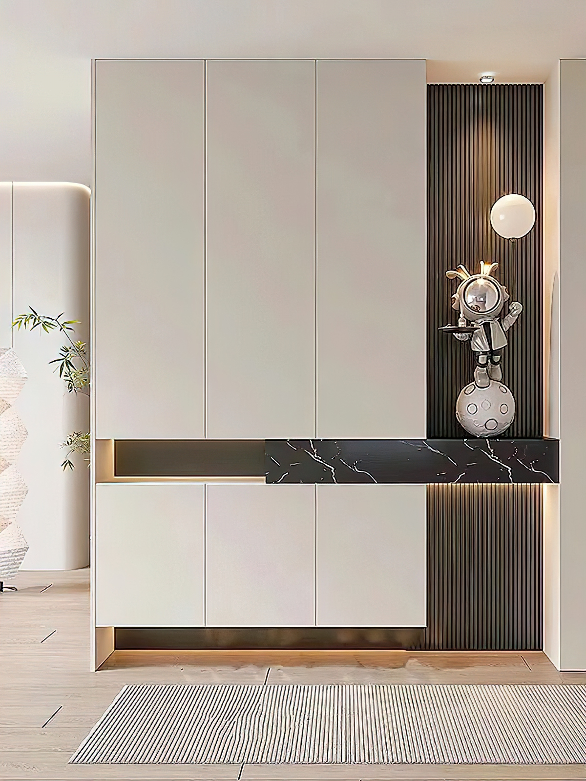
The pure cream‑style aesthetic tends to feel light and lacks visual focal points, making it easy to grow monotonous over time. Meanwhile, the traditional mid‑century modern style often leans too heavily on dark tones, which can make lower‑floor units and small apartments look dated and oppressive. This cream‑meets‑mid‑century‑modern design strikes a sophisticated balance with a light‑base, deep‑accent palette: soft cream hues provide a gentle foundation, while walnut‑toned textures add vintage flair—resulting in a look that’s warm without being cloying, and retro without feeling heavy or gloomy. It delivers both eye‑catching appeal and practical functionality.

image2

The entire design adheres to a tried-and-true color formula: 70% soft, creamy base; 25% walnut‑toned mid‑century texture; and 5% pops of vibrant accent hues. The result is a clean, airy aesthetic that enhances natural light, making it an ideal match for most entry‑level floor plans in Shijiazhuang. Strategic accents of mocha‑hued walnut introduce a touch of understated sophistication, adding depth without weighing down the light, airy palette—and banishing any “internet‑trendy, cheap” vibe. Subtle metallic details, glass panels, and vintage‑inspired lines provide just the right finishing touches, delivering refined elegance without clutter and a perfectly balanced sense of luxury.

image3

Compared with trendy, influencer‑inspired styles, the creamy mid‑century modern aesthetic better aligns with the practical needs of contemporary homes. Custom cabinetry that seamlessly blends open and closed elements offers discreet storage for everyday items, while open shelves showcase decorative pieces and cherished collectibles—keeping the space tidy without feeling sparse.

image4

The ambient lighting is the very essence of the design. By day, the space feels clean, crisp, and open; at night, when the lights are on, soft, diffused glow fills the room, instantly elevating the mood. Whether it’s for everyday meals, cozy moments at home, or relaxed family gatherings and game nights, the space exudes a laid-back, soothing vibe—offering a level of residential quality that far surpasses the typical minimalist aesthetic.

image5

It eschews elaborate forms and fleeting trends, instead relying on the interplay of materials, soft lines, and nuanced light and shadow to create a gentle, soothing aesthetic with a touch of vintage charm.
More Articles

More Posts
How should the internal structure of a custom wardrobe be designed to maximize usability? The zoning logic determines storage efficiency.
Living Knowledge · 2026.10.29

How should the internal structure of a custom wardrobe be designed to maximize usability? The zoning logic determines storage efficiency.

How should you design the internal structure of a custom wardrobe to make it truly functional? The zoning logic determines storage efficiency. The effectiveness of a custom wardrobe depends on whether its internal layout aligns with your household’s actual clothing inventory and your habits for putting things in and taking them out. The correct design sequence is: first, take stock of your clothes; second, determine the zones; and only then consider the overall style. This article provides a set of zoning principles and dimension guidelines that you can apply directly. 1. Inventory First, Design Later: A wardrobe is a reflection of your clothing collection...

How to coordinate color schemes for whole-house customization? The 60-30-10 rule and four space-specific strategies.
Living Knowledge · 2026.10.29

How to coordinate color schemes for whole-house customization? The 60-30-10 rule and four space-specific strategies.

How do you coordinate colors for whole‑house customization? The 60–30–10 rule and four space‑specific strategies. The most common reason why color schemes in whole‑house customization fall flat isn’t that the colors themselves are unattractive, but rather that there are too many colors, the proportions are out of balance, or the materials and colors aren’t well integrated. Master one fundamental principle—the 60–30–10 ratio—and then choose a strategy based on the specific spatial conditions, and you’ll be able to make color choices you won’t regret. I. The 60–30–10 Rule: Let each color...

A Guide to Avoiding Pitfalls in Whole-House Customization: 6 Things You Must Confirm Before Signing the Contract
Living Knowledge · 2026.10.29

A Guide to Avoiding Pitfalls in Whole-House Customization: 6 Things You Must Confirm Before Signing the Contract

1. Board Material Environmental Safety: Rely on Test Reports, Not Verbal Promises It’s common for sellers to tout “environmentally friendly boards” without providing any official test reports. The formaldehyde emission limit for E1‑grade boards is ≤0.124 mg/m³; some retailers use this as a claim of eco‑friendliness, but it falls short for households with elderly residents or young children. A more reliable choice would be ENF‑grade (≤0.025 mg/m³) or E0‑grade (≤0.05 mg/m³), ...

BOOK A CONSULTATION

Want to Apply These Ideas to Your Own Home?

It can explain the apartment area, decoration stage and preferred style. The BOSNIE team will combine the home encyclopedia, real cases and product systems to provide one-to-one custom suggestions for the entire home.