Morandi gray powder
Suitable for color-changing bedrooms, children's rooms and some cabinet doors, the atmosphere is gentle but not sweet.
Decorated with color symbols, dream of enjoying a sense of luxury。Use low-saturated colors and soft proportions to create a sense of high-end, suitable for families who want the space to be gentle, light, but not monotonous.
Use low-saturated colors and soft proportions to create a sense of high-end, suitable for families who want the space to be gentle, light, but not monotonous.
It is recommended to match Morandi gray, matte pink, milk white and delicate wood grain to maintain uniform color but retain layers.
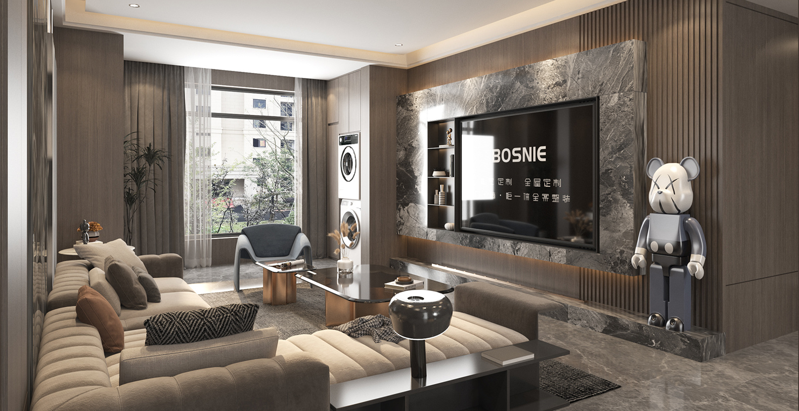
It can be combined with the BOSNIE 2026 product color atlas, door and wall cabinet integrated system and core material technology to further develop a custom solution for the entire home.
Suitable for color-changing bedrooms, children's rooms and some cabinet doors, the atmosphere is gentle but not sweet.
As a large-area basic color, it enhances space brightness and reduces color pressure.
Suitable for cabinet doors, bedside tables and sideboards, creating a clean, soft and high-end feel.
aroundMorandi RomanceThe colors, door panels, cabinets and storage logic are used to deepen the space and make the overall style more unified.
aroundMorandi RomanceThe colors, door panels, cabinets and storage logic are used to deepen the space and make the overall style more unified.
aroundMorandi RomanceThe colors, door panels, cabinets and storage logic are used to deepen the space and make the overall style more unified.
aroundMorandi RomanceThe colors, door panels, cabinets and storage logic are used to deepen the space and make the overall style more unified.
Suitable for low saturation solid color door panels, the color difference is controllable, the paint surface is delicate, and it is not easy to crack and turn yellow.
Suitable for partially shaped door panels and soft solid color expressions, taking into account delicate paint surfaces and color customization.
Long-term living spaces such as children's rooms and bedrooms can give priority to environmental protection and structural stability.
Confirm proportions, closings, materials, and functional relationships in advance during the planning stage to reduce implementation deviations in the later stages.
Confirm proportions, closings, materials, and functional relationships in advance during the planning stage to reduce implementation deviations in the later stages.
Confirm proportions, closings, materials, and functional relationships in advance during the planning stage to reduce implementation deviations in the later stages.
Confirm proportions, closings, materials, and functional relationships in advance during the planning stage to reduce implementation deviations in the later stages.
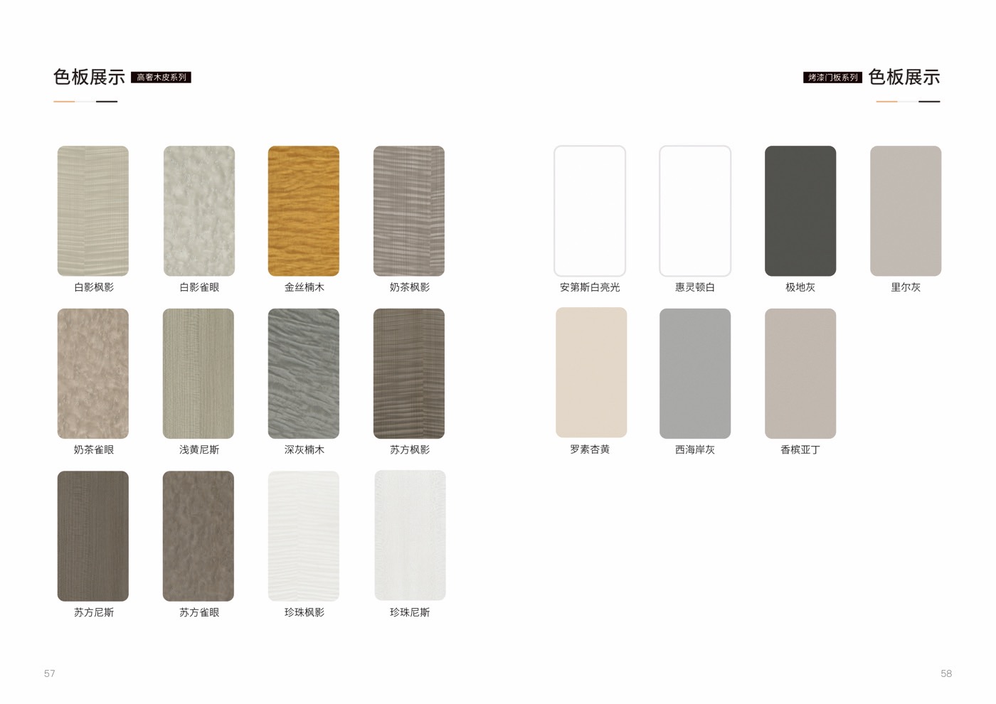
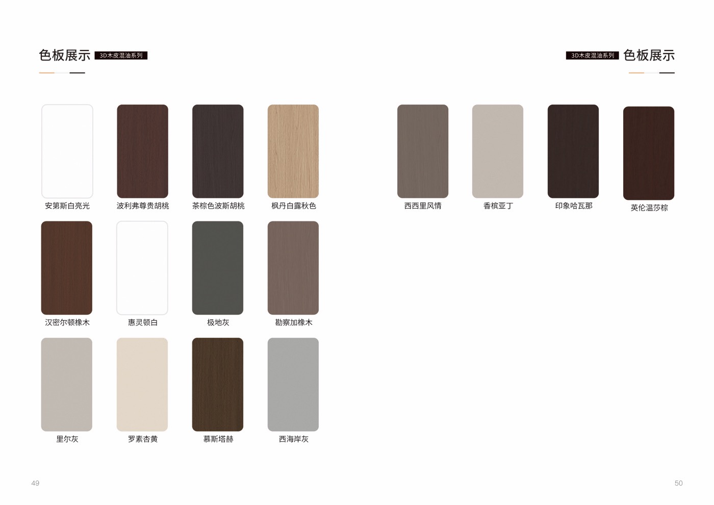
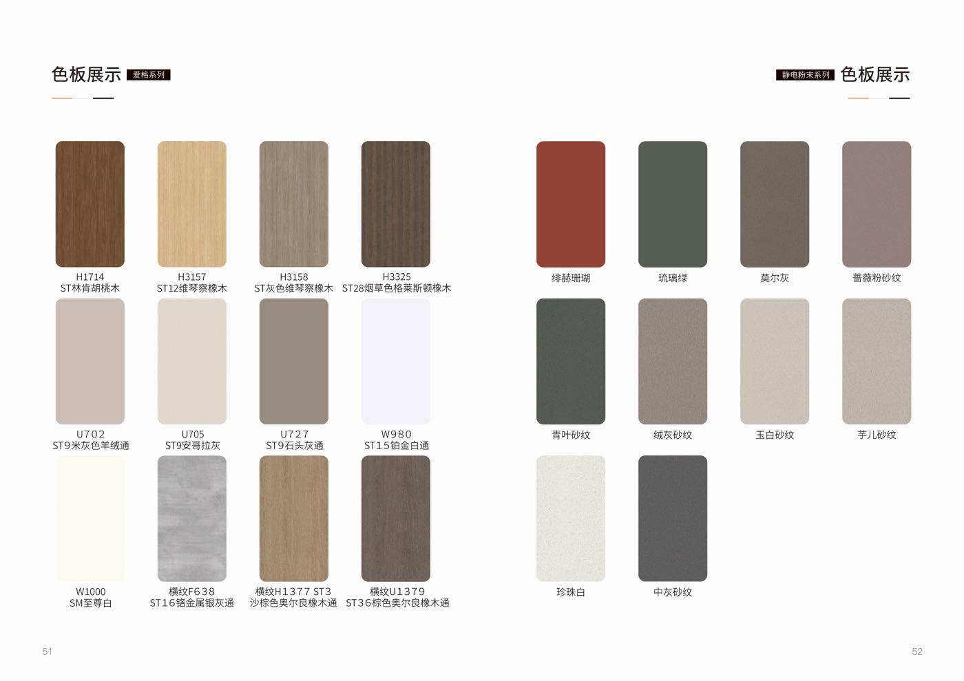
Please refer to the product range on the official website and the content of solid colors, powders, paints and children's room adaptations in the BOSNIE 2026 color atlas.
Morandi Romance is best suited to bedroom, children's room, Sideboard, cloakroom. Use low saturation color, Soft and advanced, light healing to shape the whole-home style direction.
It is recommended to match Morandi gray, matte pink, milk white and delicate wood grain to maintain uniform color but retain layers. Screen previews, catalog pages, and offline samples may differ, so confirm colors together with lighting, walls, flooring, soft furnishings, and cabinet area.
Yes. Door panels, wall panels, cabinets, concealed doors, and detailing should be confirmed within the same material and proportion logic, with special attention to grain direction, edge banding, hardware, baseboards, and on-site substrate conditions.
Bring your floor plan, site photos, preferred series name, key spaces, and budget range to the store. The design team will translate style keywords into spatial layout, material finishes, and a delivery checklist.
You can describe the apartment type, area, decoration stage and preferred style. We will provide further communication suggestions based on the product package, color materials and customization process.